Interpretation of the migration matrix
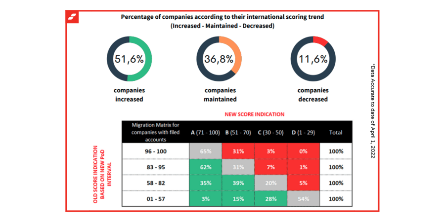
The illustration above shows the change in risk score indication on the active Belgian business population, who are obliged to file annual accounts. A comparison is therefore shown here from the old score indication to the new score indication. Such migration matrices illustrate the movements that the selected population makes between the different risk intervals (based on the PoD indicator), where the estimated risk of the two different score cards is considered and how the shift is represented.
What do we observe?
On the horizontal axis above, we see the new Belgian score indications that belong to the different international risk ratings from A to D. On the first vertical axis we see the old Belgian score indications related to the new PoD score intervals. Based on the new scorecards, companies with a score between 71 - 100, belonging to the lowest risk, will have a maximum PoD of 0.24%. In order to find the corresponding risk level in the old scorecard, the companies could not have a score lower than 96 to belong to this indication or rating.
How to interpret the percentages?
By analysing the matrix row by row, you can form a better understanding of the movements the companies make from the old score indication to the new indication. We use 3 different colors to show the effect of the change. The grey color means that there is no change of risk class. The green color, which will always be to the left of the grey indication, means that there is a positive impact. The new scorecard indicates that these companies have a lower PoD percentage, giving them a lower risk rating. The red color, which will always be to the right of the grey indication, means that there is an increased risk compared to the old score. The new scorecard indicates that these companies obtain a higher PoD percentage, giving them a higher risk rating

